1. PLANNING: 
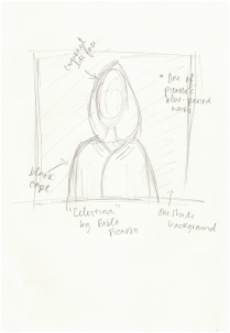
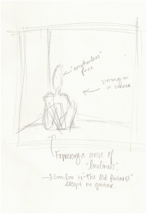
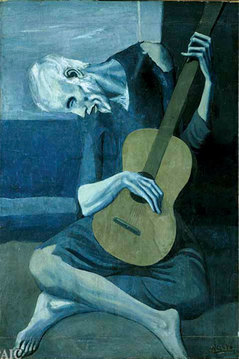
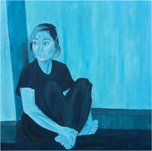
Before anything happened, I needed to make sure that all of my ideas were clearly stated for myself. Therefore, I made sure to pick my artistic inspiration. Once I chose what I wanted to be inspired by, it facilitated the process for the rest of the portrait. So, I started with sketches. I knew that I wanted to seem a bit emotionless in my portrait, as well as being in a position where I'm just lonely. It was a way to resemble "The Old Guitarist", by Pablo Picasso.
MY SKETCHES:
2. TAKING A PICTURE: 
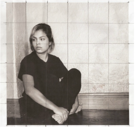
After fully developing an idea of what I wanted. I went ahead and took a picture. My sister actually took it of me, at our house. When I put the picture up on my computer to print out so I could grid it, I realized that it was going to be difficult transferring all of those colors to a one-color scheme. That is why I went ahead and edited so that it would be black and white. I knew that I needed to facilitate things as much as I could.
THE ORIGINAL PICTURE:
3. PAINT A BASE COAT: 
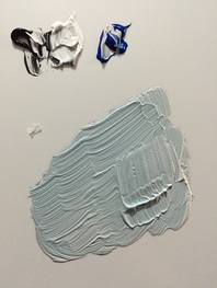
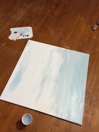
Before anything I needed to make sure that I had a base coat of paint, which was a very light shade of blue. That way, no part of the canvas could show through on my painting.
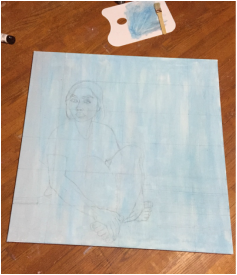
4. START GRIDING: Once the base coat of paint was done and dry, I began to grid. I first drew a grid of 6 x 6 on my picture so I did the same on my canvas. Then, I began to do the drawing process upon my canvas. It is always difficult for me to not do too much detail since it will most likely be painted over.
MY GRIDED CANVAS:
5. LET THE PAINTING PROCESS BEGIN: 
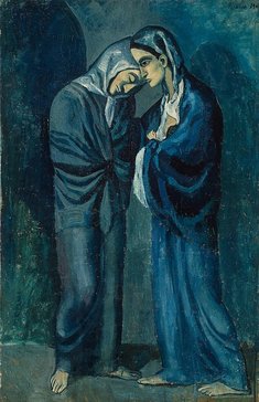
All through my painting, there were no specific techniques which I used. I just put paint on the brush then onto the canvas. However, through it all I kept looking at Picasso's works to be able to create similar stroke as well as a similar end product ..
"Happiness" Size: 91cm x 91cm medium: acrylic on canvas date: December, 2015
Exhibition text:
This piece was made to redefine myself as an artist. Besides wanting to incorporate a new form of art style, as well as building new techniques, I wanted to incorporate the overwhelming amount of emotions that are always kept within me. Inspired by Pablo Picasso's Blue Period, I used the different tones of blue to build a "cold" sensation upon the viewer. The blue is also made to create a sense of melancholy and loneliness to model the piece as an undesirable relatability.
ARTISTIC INSPIRATION:
Picasso, Pablo. ""The Old Guitarist"" Web. 14 Dec. 2015. .
Picasso, Pablo. ""The Two Sisters"" Web. 14 Dec. 2015. .
Coming into Junior Art, I was anticipating this project because we all knew that it was happening. However, I still wasn't sure who or what my artistic inspiration was going to be. I thought about the past years, and the different ones that were done. That's when Pablo Picasso's Blue Period came to mind. I didn't remember of anyone that did their painting based off of that. Well, no one who I could clearly see the resemblance from. Also, Picasso's works within this time frame of 1900-1904 were works of which I find very interesting. They are definitely something that I don't easily forget. Therefore, I chose to base my painting of of this. My main focus was to make my painting resemble "The Old Guitarist" by Pablo Picasso. That is why in my picture I am sitting on the corner of the wall, with an emotionless, yet a bit sad expression. Since in that painting the old man is looking down, I needed another painting to help me decide what to do with the eyes. In the painting "The Two Sisters", one of the sisters has her eye open and it looks larger than usual. Therefore, in my painting I wanted to exaggerate my eyes and make them look almost animated. When it came to color, I realized that the Blue Period also consisted of tints of yellow, and I made sure to incorporate that into my painting as well. The background color, as well as the skin tone, both have yellow tones. Also, when it came to blending I realized that there wasn't much done. The contrast was very high so I tried to mimic it. I definitely made sure to make my piece as closest to a Blue Period piece as possible by still making it look like an original.
meaning of piece:
Through the expression of my face, to the color of the piece, it is clear that the title "Happiness" is an ironic title. Although the piece already looks quite sad, I didn't want to double the sadness with a title that could possibly make someone cry. However, there is an actual reason to the title itself. Currently, my life has been everywhere. I do nothing but think all the time and sometimes I don't even know what I'm thinking. I have been in a place of confusion in which I don't know how I should feel about things nor what to do with them. I question whether I should be angry, upset, or happy about things which overall gets me upset at the end. I've also caused frustration upon myself of which is due to me not being able to explain to anyone how I'm feeling nor why I'm feeling a certain way. That is the main reason as to why I tried to have an expression-less face within my painting. Besides, I think that's my face for the most part now. The blue just adds a tone of loneliness and sadness of which I feel. Even if someone assures me of feeling the same way, I don't care. I never asked for someone else to feel empathy nor do I want it. I can't feel comfort knowing that somebody else is suffering/going through what I'm going through. This painting is my way of expressing the most I can. It's my way to once again feel Happiness.
Reflection:
I believe that what got me through this painting was how much I loved my idea. I think that the way of which I incorporated the movement, as well as my own originality was successful. When I finished the painting I wasn't sure if I was done. I kept looking at it as if I was missing something. I think that after so long of painting, and adjusting things, I just couldn't stop. The next day I saw my finished painting and I felt better. I felt complete almost. Throughout the process, things went by pretty smoothly. However, the only thing that kept stopping me from getting things done faster was the fact that the acrylic paint dried so fast. Due to that, whenever I would go over some spots, I would have to repaint it over again since it was dry already. I had to do that several times, so I definitely wasted some time. Also, I had a bit of a hard time trying not trying to make this piece as photo-like and realistic as possible. Personally, I'm the type of person who likes everything to be spot on the way it should be. I guess you could say I'm a perfectionist. So, working on this piece, in which I couldn't blend to create a smooth surface, I was definitely out of my comfort zone. That made me feel a bit more insecure of my painting, but I'd like to think that it still turned out well.